Colour as material
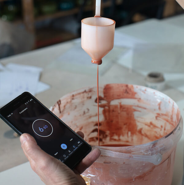
Process
The road to transparency
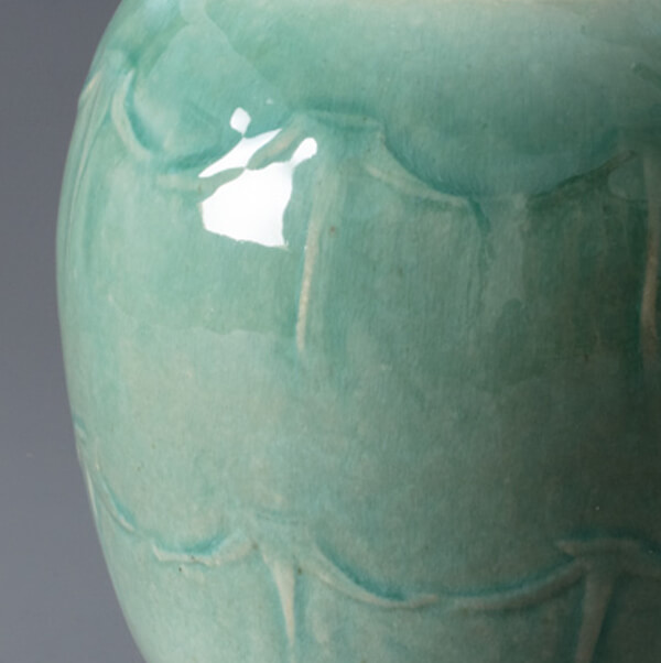
I started my studies in Fine Arts in 2006 at Ar.Co in Lisbon, beginning with painting and later moving onto ceramics. For me the ceramic piece is like an “all over” canvas. I always consider the piece as a whole, working with and valuing all parts of the piece equally. And, just like when I was painting, one of my main concerns is the presentation of depth. How to approach the difference between close and distant? My answer is with colour. To address the concept of depth I use different intensities of the same colour in each work. The difference between tones brings subtlety. So transparency became the main motivation of my glaze research. Guided by these principles, carving emerged spontaneously. Drawing is part of my daily practice, and the images that inhabit my mind are first transferred to paper and later on to the clay using the hand carving technique. The glazes are then meticulously designed to flow and pool in the depressions allowing the image to develop and become emphasised.
Thus, transparency and carving are essentials for my work, it is the way I obtain the desired difference in tone and colour, which in turn, brings about a sense of depth.


Developing glazes
A transparent glaze allows all light to pass through, as opposed to an opaque glaze in which the light does not pass. Transparent glazes look like a mirror with a true glossy light-reflective quality. Between transparency and opacity falls translucency. Transparency is hard to achieve with some colours.
At the mid-range temperature that I utilise it can be difficult to develop a method that imparts the full vibrancy of the colour through a transparent glaze. In some cases, colour prevails over transparency such as with Copper Light Blue, and in others, transparency prevails over colour, as is the case with Cobalt & Manganese Grey. So there is a need to reconcile this compromise. It is difficult to have both!
About the colours
Copper colours
I have a fascination with turquoise blue. This is because it conjures in my mind the splendid coloured domes of Iran. In my quest for a turquoise blue, I started by working with copper, the only colouring oxide that can develop into a turquoise. Although my experiments did not work as expected, it wasn’t fruitless. Firstly, I realised that at mid-range temperature the presence of copper is not guaranteed to obtain the colour blue… but can actually result in the colour green!
The outcome of this process resulted in three fantastic colours: Copper Dark Green, Copper Green and Copper Light Blue. To obtain Green and Light Blue I also used tin oxide in different proportions. However, as tin is an opacifier, the Light Blue colour is more translucent than transparent. This translucent Light Blue is, so far, the closest I have come to turquoise.


Iron colours
Iron is one of the most common colouring oxides in ceramics, mainly because of the large spectrum of colours and effects it can establish. I use iron to get brown. There are other oxides that turn brown, but I prefer iron because of the high level of colour uniformity, this is due to the small size of the iron particles. On the carving edges, iron tends to envelop a beautiful rusty orange colour as a result of lower concentration in that area. I’m still refining the Copper & Iron Brown in order to obtain greater transparency.

Cobalt colours
Cobalt is the most stable and reliable colouring oxide. It is probably also the most powerful one. As little as a tenth of a gram can create the desired effect. This is important because cobalt is very expensive! Research on cobalt has been facilitated by my utilisation and experimentation with copper. This time I knew exactly what I was going to get: a reliable glaze that is Cobalt Bluish Grey, and a related glaze – Copper & Cobalt Blue. Both these glazes show a high degree of transparency.
Due to its historical association with royalty and liturgical robes, the colour purple arouses an enormous interest in me. When I developed the cobalt and manganese glaze, I was really expecting a variant of purple, but this was illusionary…It turned out to be grey, Cobalt & Manganese Grey.


Nonetheless, in addition to a very pleasing shade of grey, this is probably the glaze with the most “pixels”, and at its highest level of transparency has a structure that reveals exquisite details of the incised and carved work.
Chromium colours
During my endeavours to obtain purple, Chromium Pink emerged. Chromium is a difficult oxide to work with, a true turncoat. Sometimes, even in the same piece, the glaze has two distinct colours: pink and a greenish white. I am still working to create a stable colour. This glaze shows a low degree of transparency, but presents an interesting texture.


